Table of Contents
- What are Pop-Up Messages on Websites?
- Tips to Create the Best Pop-Up Design
- Maintain the Relevance of Pop-Up Content
- Highlight Important Information
- Match Pop-Up Design to Your Site
- Use Color Blocks and Backgrounds
- Make Sure Your Pop-Up Are Responsive
- Personalize Your Pop-Up
- One Pop-Up — One Message
- Keep Input Boxes to a Minimum
- Get Creative With Different Shapes and Fonts
- Include a Simple Exit Option
- Make Your Design Appealing
- Improve Your Text
- Always Include a Call to Action
- Do A/B Testing
- Pick the Right Time and Never Interrupt the User Experience
- Color Contrast Is Your Friend
- Pop-Up Trends 2023: Pop-Up Design Examples
- FAQs
In the world of website design, competition is fierce. First impressions are more important than ever. Pop-ups are among the most effective ways to get visitors' attention. They can help increase engagement. But not all pop-ups are created equal. Poorly designed pop-ups can do more harm than good. You must create an appealing and targeted pop-up to grab your audience's attention.
Are you looking to promote a new product? Collect email addresses? Or do you want to increase your social media followers? A well-designed pop-up will help you achieve your goals! But how do you create a website pop-up design for your website? It's more complex than sketching out a few flashy graphic elements and calling it a day.
This guide will review the basic steps of creating a pop-up design. We'll explain the best way to choose a pop-up design. Using these guidelines, you will be able to create pop-ups that not only attract attention. They also effectively convert your website visitors into loyal customers. But for your convenience, we will also show you some pop-up design examples.
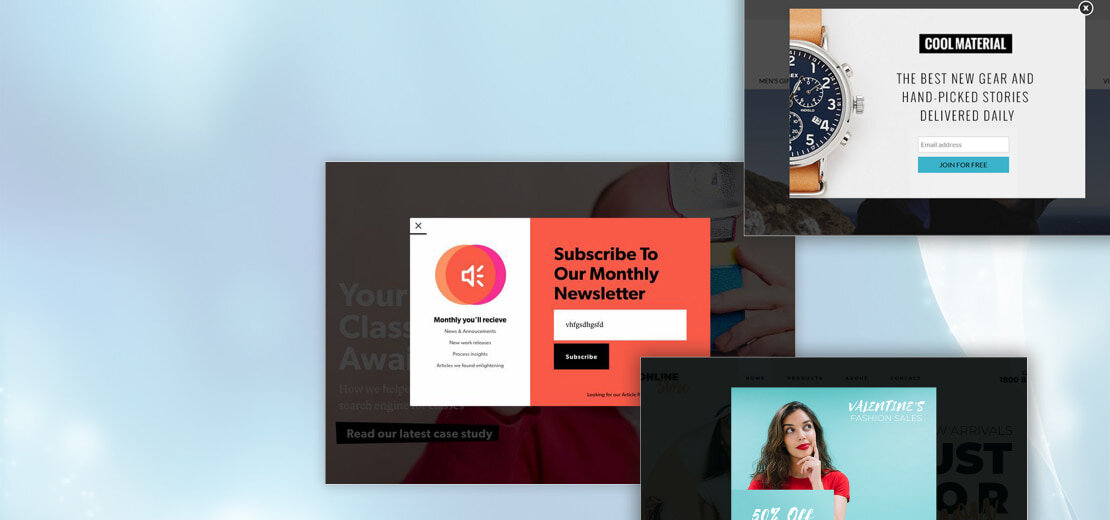
What are Pop-Up Messages on Websites?
Pop-up formats are graphical user interface (GUI) elements. They appear on top of the website content, usually as a window, dialogue box, or banner. Developers embed them to attract the user's attention. They're also designed to convey a specific message or call to action. Pop-ups can appear automatically when the user visits the site. But users can also trigger them themselves. For example, if they click a button or scroll down the page.
There are many different types of pop-up messages on websites. Each has a different purpose and design. Some common examples include:
- Exit pop-ups. These pop-ups appear when a user is about to leave the site. They are designed to prevent him from doing so. They usually offer discounts or incentives to encourage users to stay on the site.
- Newsletter subscription pop-ups. These pop-ups appear when the user first visits the site. They ask them to provide an email address in exchange for news.
- Product advertising pop-ups. These pop-ups advertise a specific product or service. They often offer discounts or other incentives to encourage the user to purchase.
Pop-up designs grab a user's attention. They can promote user engagement. But they can also be annoying and intrusive if they are improperly designed. To avoid frustrating users, it's important to use pop-ups sparingly. You must ensure that they are relevant and timely. Using pop-ups strategically, site owners can increase conversions and improve the user experience.
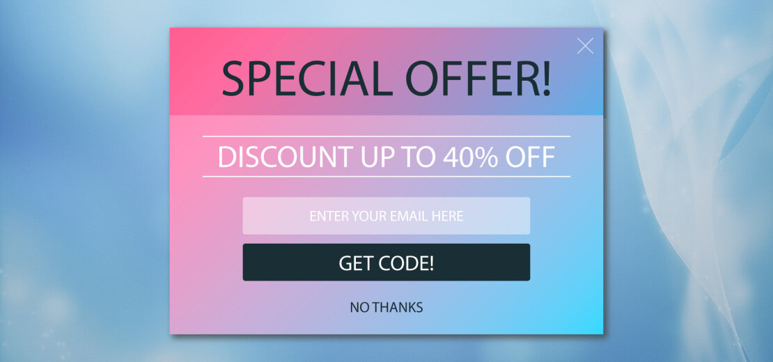
Tips to Create the Best Pop-Up Design
When designing a website pop-up design, it's important to keep the user experience in mind. And, of course, don't forget about the specific purpose of the pop-up.
Creating a successful pop-up can be a great way to attract customers or buyers. To get the best results, there are some key tips to keep in mind when designing pop-ups.
There are many options on how you can effectively create a pop-up design. They should all be consistent with the content of the page. You shouldn't forget about using too many unnecessary graphics. It can reduce user engagement and alienate the experience.
The pop-up format can confuse users if you go overboard. It will make customers less likely to click on the button. So, we're here to help you! With our great tips, you can create the best pop-up designs. It won't alienate your customers. On the contrary! According to our tips, all pop-ups will bring advantages over competitors!
Here are the best tips we've gathered from personal experience on creating effective pop-up designs:
Maintain the Relevance of Pop-Up Content
Let's start with the first important aspect. You must always keep the content up to date. Pop-up messages on websites should be closely related to the current context. It will help increase the likelihood that the user will access the pop-up.
For example, a pop-up offers a discount on a product. Then you should set it up on the product rather than the home page. So keep it relevant. Then users will consider the pop-up as a useful tool for the user.
Highlight Important Information
The next step is that you should highlight important information. Use design elements such as bold font or contrasting colors. This way, you can draw attention to important information in the pop-up design. It will help the user see the most important information immediately. So, it will increase the effectiveness of the pop-up in achieving its goals.
By highlighting key information, you'll increase conversion rates. For example, a pop-up window advertises an offer with a limited expiration date. So, you can highlight the expiration date in bold. That way, users won't miss it.
Match Pop-Up Design to Your Site
The pop-up format should match the design of the site. This way, you maintain consistency and don't confuse the user. It includes using similar colors, fonts, and images. It is how you will create a cohesive visual image of the site.
For example, the site has a minimalist design with lots of white space. Then, the pop-up should also have a clean and simple design. Similarly, the site uses bold and bright colors. Then the pop-up design should also have similar colors. That way, you can maintain visual consistency.
Does the pop-up design match the site design? Then users are more likely to trust it. They will interact with the site. It will lead to more conversions and a better user experience.
Use Color Blocks and Backgrounds
Another pop-up design example is the use of color blocks or backgrounds. They will complement the color scheme of the site and its branding. But you must use the right colors.
Contrasting colors attract the attention of the user. But you should use them sparingly. You should not overload the user with them and not contradict the site's design.
Using a background image will help increase interest. Use color blocks and backgrounds strategically. Then you can make your pop-ups more visually appealing. You can increase their effectiveness in attracting users and conversions.
Make Sure Your Pop-Up Are Responsive
Nowadays, people are using mobile devices more and more. It means it's important that the pop-up format is responsive on screens of all sizes. A pop-up that looks great on a desktop computer may not be readable or usable on a mobile device, resulting in a poor user experience and loss of conversions.
Want to ensure pop-ups are responsive? Then use a design that adapts to different screen sizes and orientations. It can include using adaptive font sizes. Remember about image scaling.
You must test on different devices. That way, you can make sure it looks good and functions properly. By providing convenience, site owners ensure it is convenient for all visitors.
Personalize Your Pop-Up
Personalization can be a powerful tool for increasing engagement. You can use some data to create a website pop-up design with specific user interests.
For example, you can make a pop-up offering a discount on an item. If the customer is interested in the product, it's likely to be more effective. Similarly, addressing the user by name can create a sense of connection. It will increase the user's trust in the site.
By personalizing pop-ups, site owners can create a more relevant user experience. It is more likely to drive conversions and goals.
One Pop-Up — One Message
When designing the best pop-up designs, it's important that the message is clear and focused on one goal. Including multiple sentences can confuse the user. In this way, you'll reduce the effectiveness of the pop-up. Instead, focus on one message for each pop-up.
Concentrate on one message. For example, promote a new product or offer a discount on a certain product. Then users are more likely to understand the offer and take the desired action.
Also, keeping the pop-up brief will help increase engagement. It will prevent users from feeling overwhelmed or frustrated. Follow the "one pop-up, one message" rule. Then you can create more effective pop-up messages on websites.
Keep Input Boxes to a Minimum
The pop-up requires users to enter information. For example, it could be an email address or a phone number. You need to keep the number of input fields to a minimum. Asking for too much information can be overwhelming to the user. It will cause them to abandon the pop-up.
Instead, request only the most necessary information in the pop-up design. For example, a pop-up offers a newsletter subscription. Request only the user's email address. Also, use prefilled input fields. It can make it easier for users to enter information. It will increase the likelihood that they will fill out the form.
Keep the number of entry fields to a minimum. This way, you can get more user-friendly pop-ups. They are more likely to achieve their goals.
Get Creative With Different Shapes and Fonts
It's important to be consistent in your branding and website design. But in website pop-up design, you can use different shapes and fonts. It can create a more visually interesting and memorable pop-up.
Experimenting with unique fonts can give your pop-up a personality. You'll be able to make it stand out from the rest. Similarly, using non-traditional shapes such as circles or triangles can help draw attention and add visual interest.
But you must ensure that the shapes and fonts used are readable. They should not distract from the pop-up message. Thus, use different shapes and fonts. That way, you can create effective pop-ups.
Include a Simple Exit Option
Yes, pop-ups can be effective in increasing conversions. But they can also frustrate users. Worse, if customers can't easily close or exit it.
Include a simple exit option, such as a clear and visible "X" button. It will help make pop-up messages on websites less intrusive. You will improve the user experience. Also, allowing users to exit the pop-up without taking any action, such as subscribing to a newsletter or making a purchase, can help reduce frustration and increase trust in the site.
So include a simple exit option. That way, you'll create less intrusive pop-ups. They will provide a better user experience while still achieving your goals.
Make Your Design Appealing
It is important to create a website pop-up design that is visually appealing. It should match the overall branding and design of the site. Creating a professional and visually appealing pop-up design will help you:
- Using high-quality images.
- Using relevant colors that complement the site's color scheme.
- Using clear and easy-to-read fonts.
Use design elements that reflect your site's niche or industry. It will help create a sense of relevance and credibility to the pop-up message. For example, use images of satisfied customers or products. It can be effective for e-commerce sites. Or using statistics or data would be relevant for B2B sites.
Improve Your Text
The text used in a pop-up can make a big difference in its effectiveness in achieving its intended goals. Use clear and concise language that is easy to understand. Also, use persuasive language. They should emphasize the benefits of the proposal or call to action. Use action-oriented words such as "Get" or "Start." It can be effective in prompting users to take action.
When creating a pop-up design, it's important to avoid using complicated wording. Finally, make sure the text is legible and easy to read. It will help improve the user experience. Improve the text used in the pop-up. This way, you can create more effective pop-ups.
Always Include a Call to Action
A call to action (CTA) is a key element of any website pop-up design. A CTA is a clear and specific statement. It tells the user what action they should take. For example, it could be "Subscribe now" or "Make a purchase now."
You should place the CTA in a prominent place. That way, users will understand exactly what they need to do to take advantage of the offer. You can also use urgency and scarcity. For example, "The offer is limited in time" or "Only a few spots left." It can effectively encourage users to take action.
When creating a CTA, using language that matches the site's tone is important. It should reflect the value proposition. Include a clear and effective call to action in the pop-up design. This way, you can increase users' likelihood of paying attention to the action.
Do A/B Testing
A/B testing is a method used to compare the effectiveness of two different versions. You can use this testing to choose the best pop-up designs. You can create two different versions of the pop-up. Test them on a sample of users. That way, you can determine which version is more effective.
When doing A/B testing, testing only one variable at a time is important. For example, test the CTA button's color or the headline's wording. This way, you can pinpoint which variable handles any differences in effectiveness.
Use A/B testing to optimize the pop-up design. It is how site owners can create effective pop-ups. They will achieve their goals and improve the user experience.
Pick the Right Time and Never Interrupt the User Experience
Timing is the most important factor in pop-up success. Pop-ups that appear too early or too often can be intrusive. They then only annoy users. It will lead to a negative experience.
It is important to choose the right time to show the pop-up window. For example, the user has spent some time on the site. Or he has scrolled to a certain place. Then you can run pop-up messages on websites. Also, it's important to maintain the user's experience. For example, don't show a pop-up window while watching a video or filling out a form.
Choose the right times and avoid interrupting the user experience. That way, you can create pop-ups more likely to be well-received.
Color Contrast Is Your Friend
When choosing colors, it's important to consider the site's color scheme. You should use colors that complement the overall design. Using contrasting colors in a pop-up format can help attract attention.
Also, using a contrasting color for the CTA button can help make it stand out. This way, you will increase users' likelihood of clicking on it. However, it is important to avoid using too many colors. It can make the pop-up design look cluttered and unprofessional.
Use color contrast strategically. You will be able to create more effective pop-ups.
Pop-Up Trends 2023: Pop-Up Design Examples
In 2023, people still expect website pop-up design to be present in the design industry. Inspired by the idea of creating something interesting and unexpected, designers will use the pop-up format to create amazing experiences for their clients. People will use a variety of:
- Colors
- Shapes
- Sizes
- Textures
- And other materials.
The pop-up will be cleverly incorporated into any website. It is new, sustainable, and stable. But pop-up trends are no longer just about aesthetics (although aesthetics remain, too!). They're also becoming a way for people to arrange space in new ways. By rethinking how they are used, dynamic pop-up designs can help create an interesting experience.
Bonobos
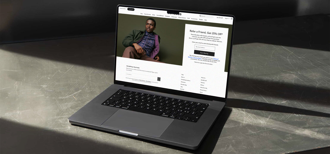
Bonobos, an online men's clothing store, is an example of a brand that uses pop-up design. Their pop-ups have a clean, minimalist design. Still, it has bold typography and simple graphics.
They often use personalization, offering recommendations based on past purchases. Or offering something based on the user's browsing history. They also use gamification. It is how they encourage users to take action. For example, they offer a discount code in exchange for subscribing.
Overall, Bonobos pop-ups are effective in drawing attention to important information. They encourage users to take action while maintaining a clean and modern aesthetic.
Fable and Mane
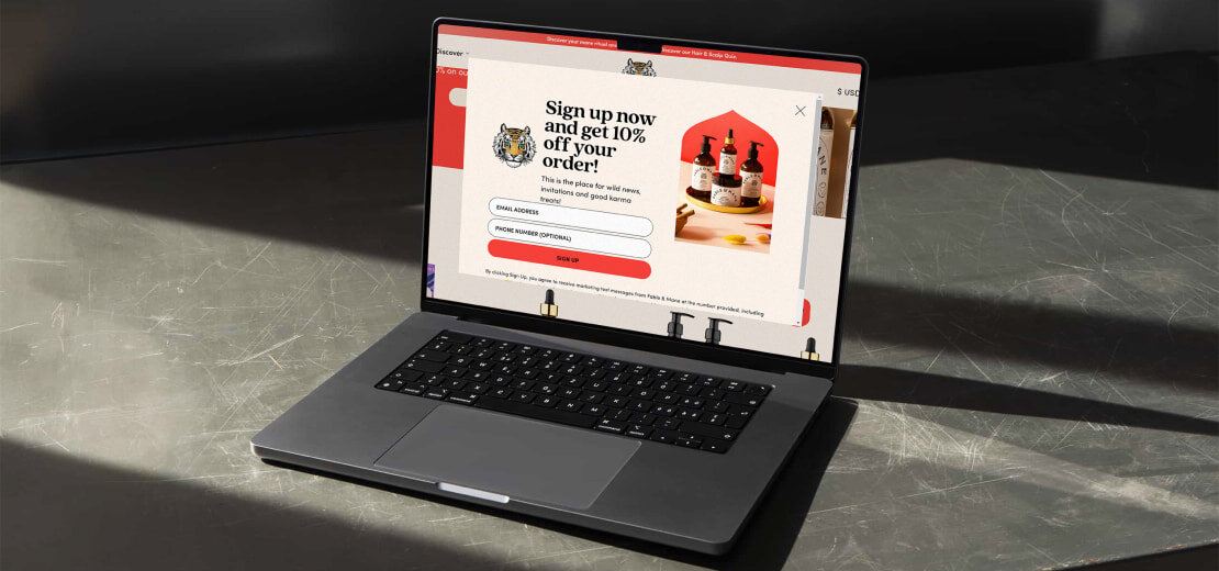
Fable and Mane, a hair care brand, is another example of a brand that uses pop-ups effectively. Their website pop-up design is often bright and eye-catching. They use bold typography and playful graphics.
They often use personalization, offering recommendations based on the user's hair type or concerns, and often include a discount code or other incentive to encourage the user to purchase. They also use social proof. They place customer testimonials or reviews in their pop-ups.
Overall, Fable and Mane's pop-ups are effective! All because they convey a playful and vibrant brand aesthetic. And at the same time, they encourage users to take action.
Chillhouse
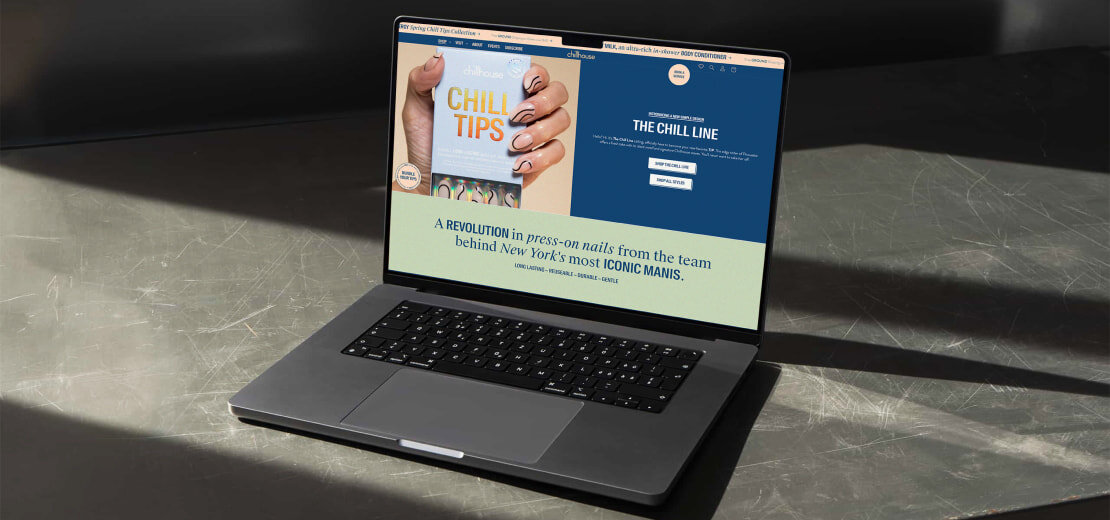
Chillhouse is a brand of health and beauty products. And it's another great example of the best pop-up designs. Their pop-ups often have soothing colors. They have a minimalist design with simple, elegant typography.
They often use personalization, too. They offer recommendations based on the user's self-care interests or concerns. They also use social proof. They place customer testimonials or testimonies in their pop-ups.
Chillhouse pop-ups effectively create a calm and relaxing atmosphere. At the same time, they encourage users to take action. For example, they encourage users to make an appointment with a spa or purchase products. Their pop-up designs reflect the brand's commitment to self-care and healthy living.
How to Customize a Pop-Up?
Setting up a pop-up usually involves using a website or app to select your pop-up design, content, and settings. We offer Portfoliobox to help you choose a site! Our site will allow you to create the best pop-up designs.
It includes selecting a template or creating a pop-up design from scratch. Add text and graphics, set timing and triggers for the pop-up, and integrate it with your site or platform.
At Portfoliobox, you'll find inexhaustible inspiration for effective customer integration. Don't hesitate to come to create sites with different pop-up design examples.
FAQs
What is a pop-up strategy?
It is an approach to marketing or sales. It uses temporary, eye-catching displays. People use them to promote a product or service.
Why are pop-ups successful?
Pop-ups are successful. They increase brand awareness and stimulate impulse buying behavior. They create a sense of urgency.
What is the best way to design a pop-up?
The best way to design a pop-up is to start with the customer in mind. Consider what they want and how you can offer it engagingly and compellingly. Use bold colors and minimalistic designs. Think about personalized content and social proof to create the most effective pop-up.


