Choosing background image for your site can be tricky. There is a wide variety of screens. All have different sizes and proportions. A background image will render variably depending on the screen and may be cut. Let's take the three images below to illustrate the point.
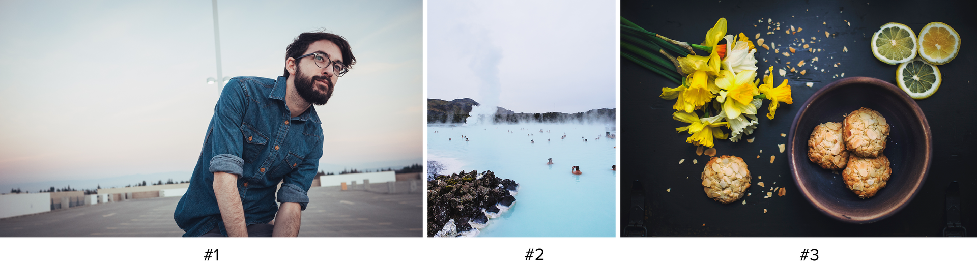
#1 — A wide photo of a man taken in landscape mode.
The image below works on a computer screen and a tablet but not so well on a phone screen in portrait mode, as the subject is not centered. Do you want this mans's head to be seen even on mobile phone? A solution would be to crop the image before uploading it in order to center the subject .
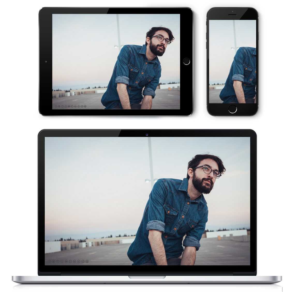
#2 — An icelandic landscape taken in portrait mode.
This image is taken in portrait mode and will therefore be cut on computers or tablets (in landscape mode). However, since the main scene is quite centered, the rendering remains good on all devices.
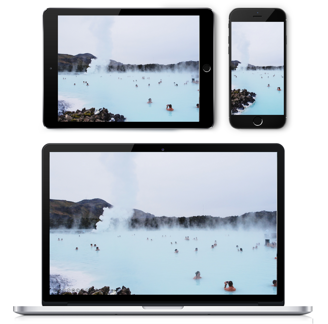
#3 — A food photograph taken in landscape mode.
There is no main subject in this photo, the eyes wanders around. It will therefore fit several devices even if the image is cut.
When choosing a background image, you need to keep in mind that it is impossible to have the exact same rendering on every device. You can ask yourself a few things:
• Does my image contain a main subject/object/scene that should be seen? If so, the main subject has to be centered.
• How will it render on a very small screen or on a very wide one? You can upload an image and check the rendering on several devices in order for you to choose the best fitting image.
• Is my image big enough? We recommend that you upload images that are 1920 px wide or high, in order for them to be sharp even on wide screens.


