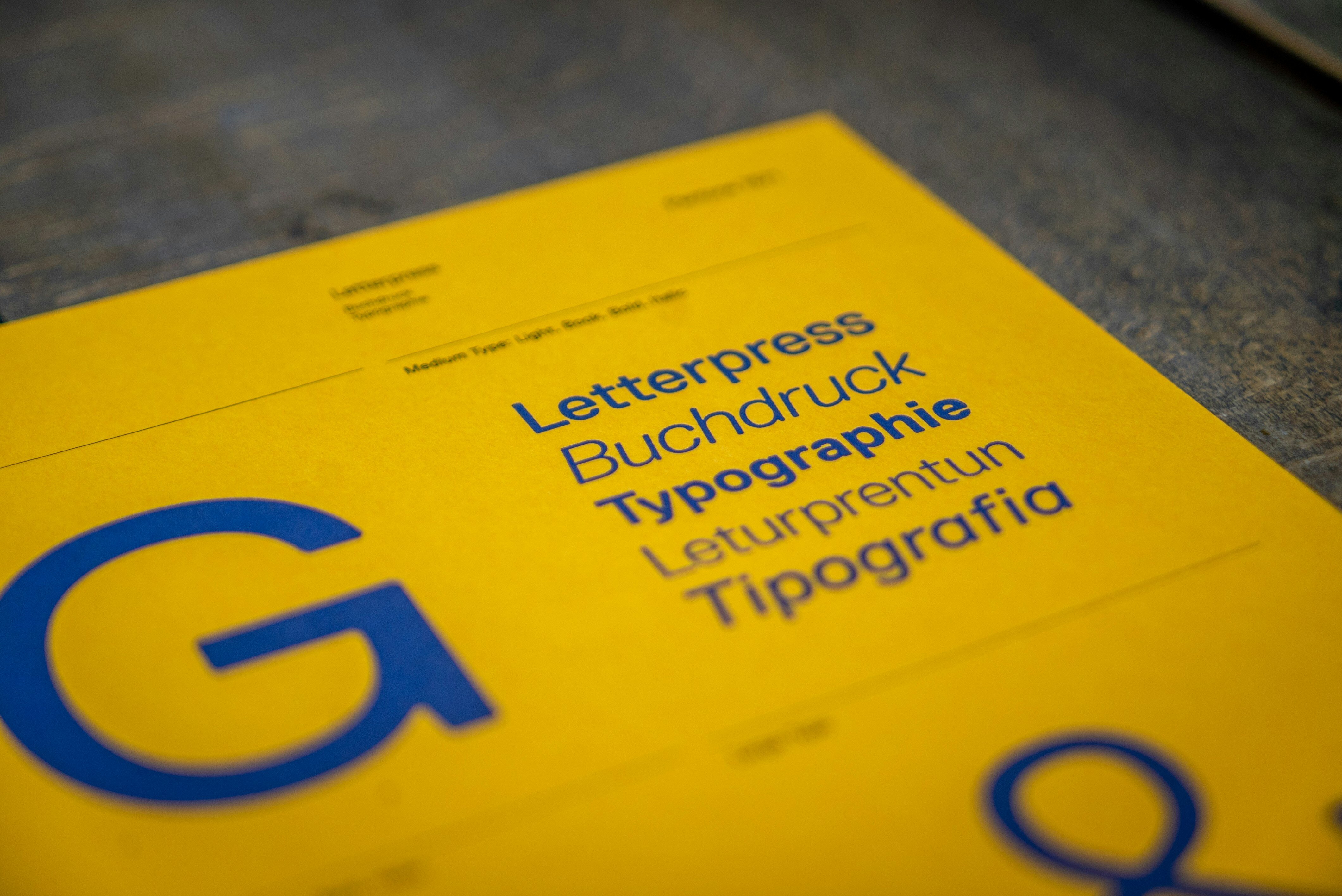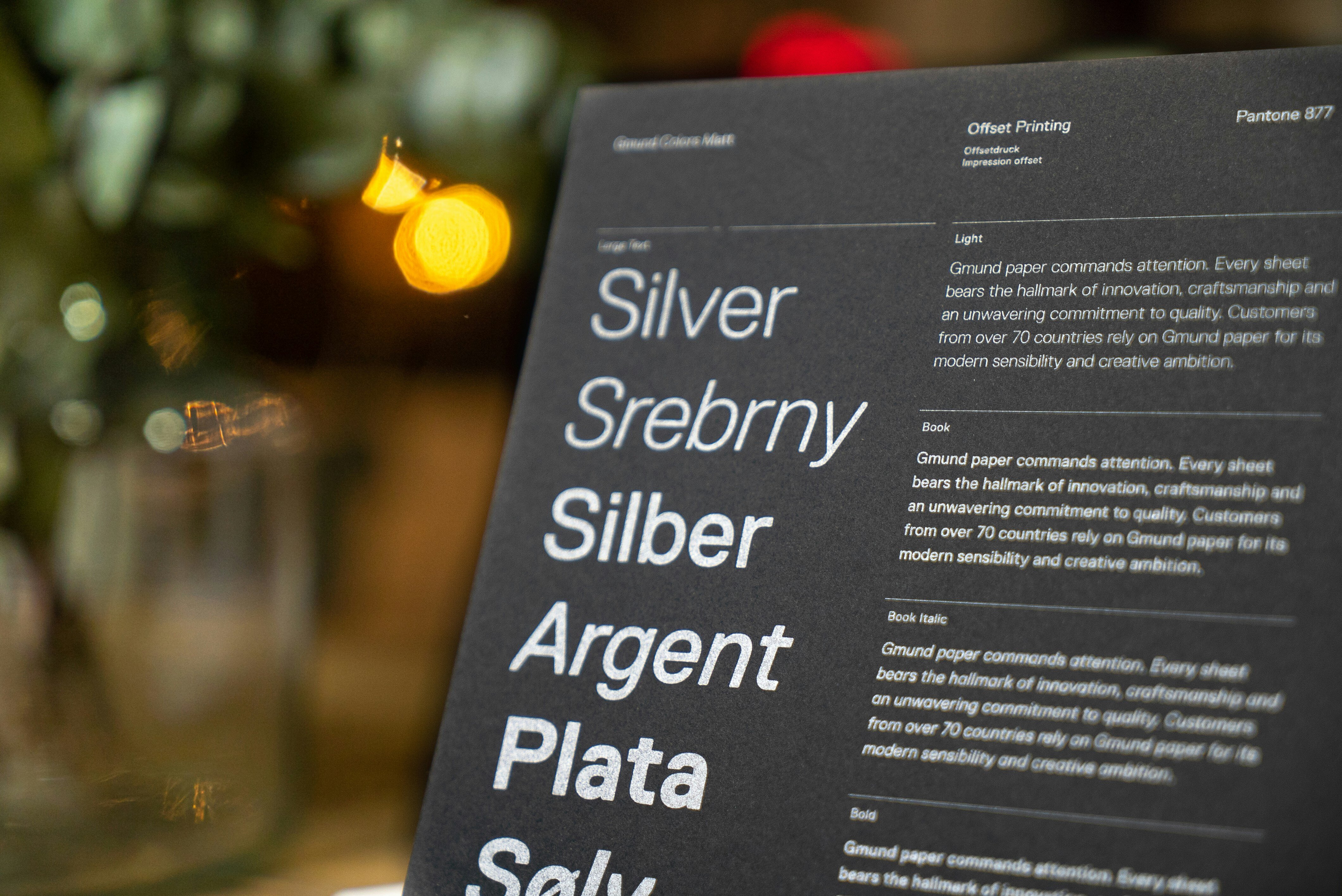
Typography is an essential aspect of design that can often be overlooked. It is the art and technique of arranging type to make written language legible, readable, and appealing when displayed. The arrangement of type involves selecting typefaces, point sizes, line lengths, line-spacing (leading), and letter-spacing (tracking), as well as adjusting the space between pairs of letters (kerning). Good typography enhances the readability of content and ensures the message is communicated effectively. In the world of design, ignoring typography can be a costly mistake. This article will explore how to avoid common typography mistakes and enhance readability, ensuring your design work is both beautiful and functional.
Table of Contents
- Introduction to Typography and Its Importance
- Common Typography Mistakes to Avoid
- Enhancing Readability: The Role of Typography
- Practical Tips to Avoid Common Typography Mistakes
- Showcasing Your Typography Work with Portfoliobox
- Selling Your Designer Services on Portfoliobox
- Building Your Design Portfolio: A Guide for Beginners
- A Step-by-Step Guide to Enhancing Typography Readability
- Conclusion: The Impact of Good Typography on Your Design Career
- FAQ
Introduction to Typography and Its Importance
Typography is often considered the backbone of design. It's not just about making words look attractive; it's about imbuing them with a voice and personality. When done correctly, typography can capture the attention of the audience, evoke emotions, and set the tone of the message. It is a powerful tool for branding and can be the difference between a design that is professional and one that is amateur.
Good typography contributes to the overall user experience. It guides readers through the content, making it easy to understand and digest. It's not just about the written word but how those words are presented. The importance of typography in design cannot be overstated. It is essential for conveying the right message and for the readability of the text.
In the digital age, typography is more important than ever. With the array of devices and screen sizes, designers must ensure that typography remains consistent and readable across all platforms. The right typography can make your content accessible and inclusive, which is crucial in a world where content is consumed globally.
Common Typography Mistakes to Avoid
Typography is a subtle craft, and it's easy to fall prey to common mistakes that can undermine the effectiveness of your design. One of the most frequent mistakes is the overuse of different typefaces. Using too many fonts can create a chaotic and unprofessional look. Sticking to a maximum of two or three complementary typefaces can keep your design cohesive.
Another mistake to steer clear of is neglecting the proper alignment of text. Text should be aligned with a purpose, whether it's to create a visually clean look or to guide the reader's eye. Centered text can be difficult to read if overused, so it's best reserved for short bits of text like headings or calls to action.
Ignoring the hierarchy of information is also a common pitfall. Typography can be used to establish a visual hierarchy that prioritizes content, making it easier for readers to navigate through information. Size, weight, and color are tools that can be employed to distinguish between primary and secondary information. Without a clear hierarchy, readers can become lost and disengaged.

Enhancing Readability: The Role of Typography
Readability is crucial in typography. The primary goal is to ensure that the audience can read and understand the text without strain. Typography plays a significant role in this by affecting the way users process information. Readable typography doesn't distract; it should be almost invisible to the reader, allowing them to focus on the content.
Line length is an important factor in readability. Lines that are too long can make it difficult for the eye to track from one line to the next, while lines that are too short can be jarring and interrupt the reading flow. Optimal line length is generally considered to be between 50-75 characters, including spaces.
Leading, or line spacing, is also key to readability. Too little leading can make text appear cramped and can cause the reader's eye to skip lines. Too much leading, on the other hand, can disconnect the lines of text, making it difficult for the reader to follow. A good rule of thumb is to set leading to approximately 120%-145% of the font size.
Practical Tips to Avoid Common Typography Mistakes
To avoid common typography mistakes, here are some practical tips. First, understand the basics of typography. Learn about different typefaces and their personalities. Choose fonts that complement the mood of your content and the tone of your design. Limit font usage to create a clean and professional look.
Pay attention to the details. Kerning, tracking, and leading can greatly affect the readability of your content. Kerning adjusts the space between individual letters, tracking adjusts spacing uniformly over a range of characters, and leading controls the vertical space between lines of text. Small adjustments can have a big impact on the overall readability and aesthetic of your design.
Finally, test your typography across different media. What works on a desktop screen may not work on a mobile device. Make sure that your typography is responsive and that it maintains readability and legality across all platforms.
Showcasing Your Typography Work with Portfoliobox
Portfoliobox is an online platform that enables designers to create a professional and personalized portfolio website with ease. Showcasing your typography work with Portfoliobox can help you attract clients and demonstrate your design skills. With customizable templates and intuitive design tools, Portfoliobox allows you to create a portfolio that highlights your best work.
When showcasing your typography projects, focus on diversity and versatility. Include a range of work that shows you can handle different styles and challenges. Use high-quality images and provide context for each project. Explain the choices you made regarding typefaces, spacing, alignment, and hierarchy, and how they contribute to the effectiveness of the design.
A well-organized and curated typography portfolio can serve as a testament to your design expertise. Portfoliobox offers a platform that is both visually appealing and functional, allowing you to make a strong impression on potential clients and employers.
Selling Your Designer Services on Portfoliobox
Selling services as a designer with Portfoliobox can be a game-changer for your career. With its professional storefront feature, you can showcase your services and allow clients to book and purchase them directly from your portfolio website. This creates a streamlined process for both you and your clients, making it easier to manage projects and communications.
To effectively sell your services, present a clear and concise list of what you offer. Describe each service in detail, including the scope, deliverables, and pricing. High-quality visuals and case studies can help potential clients understand the value of your work and why they should choose you over other designers.
Leverage the built-in SEO tools to increase your visibility online. By optimizing your portfolio for search engines, you can attract more traffic and potential clients to your site. Regularly update your portfolio with new work and client testimonials to keep it fresh and engaging.
Building Your Design Portfolio: A Guide for Beginners
For beginners looking to build their design portfolio, it's important to start with a strong foundation. Your portfolio should be a reflection of your skills, style, and the type of work you want to attract. Select your best work to display, even if it's just a few pieces to start with. Quality trumps quantity; it's better to have a handful of outstanding projects than a multitude of mediocre ones.
Create a narrative for your portfolio. Each piece should tell a story about the challenges faced, the solutions provided, and the results achieved. This provides context and demonstrates your problem-solving abilities. Include process work to show your thinking and development stages. This can be as valuable as the final product.
Make sure your portfolio is well-designed and easy to navigate. It should be a showcase not only of your work but of your design sensibilities. Pay attention to the details, such as typography, as this will be indicative of your professionalism and attention to detail.
A Step-by-Step Guide to Enhancing Typography Readability
Enhancing typography readability can be achieved by following a step-by-step guide. First, select a typeface that is appropriate for the content and the medium. Serif fonts are often used for print due to their readability, while sans-serif fonts are favored for digital screens for their clean and modern look.
Second, establish a clear hierarchy. Use size, weight, and color to differentiate between headings, subheadings, and body text. This will guide the reader through the content and make it easier to find information.
Third, fine-tune the details. Adjust kerning, tracking, and leading to improve the overall legibility of the text. Test different settings to find the perfect balance that enhances readability without compromising the design.

Conclusion: The Impact of Good Typography on Your Design Career
Good typography can have a significant impact on your design career. It demonstrates your attention to detail and your understanding of how design influences user experience. By avoiding common typography mistakes and enhancing readability, you can create work that stands out and communicates effectively.
Your typography skills can set you apart from other designers and can be a deciding factor for clients and employers. Investing time in mastering typography is an investment in your career. As you build your portfolio and sell your services, remember that good typography is a hallmark of good design.
Showcasing your work with Portfoliobox and selling your design services on the platform can provide you with the professional edge you need. Take advantage of the tools and features it offers to present your skills and attract clients who appreciate the value of well-crafted typography.
FAQ
Q: How many typefaces should I use in my design? A: To maintain a clean and cohesive look, it's best to use a maximum of two or three complementary typefaces.
Q: What is the optimal line length for readability? A: The optimal line length for readability is generally considered to be between 50-75 characters, including spaces.
Q: How can I improve the kerning in my design? A: To improve kerning, adjust the space between individual letters manually, if needed. Focus on creating visually even spacing and consider the shape and size of the letters.
Q: Why is it important to have a responsive typography design? A: Responsive typography ensures that your content is legible and accessible on all devices and screen sizes, providing a consistent user experience.
Q: Can typography really influence the success of my design career? A: Yes, good typography can significantly influence the success of your design career by showcasing your professionalism and attention to detail, which are crucial for attracting clients and employers.


