In today's digital age, developing a website with great UX is crucial for having good business results. UI design is a critical element in achieving this goal. It's because it directly impacts how users interact with your product. A UI style guide is a tool that ensures efficiency in UI design. Our team has prepared a list of the best UI design style guide templates for better UX. It includes:
- Material Design;
- IBM Design Language;
- Atlassian Design Guidelines;
- Pattern Libraries Template;
- Apple Design Template.
Actually, a well-designed UI style guide says about the consistency of UX across platforms.
Creating a UI style guide may seem like an additional step in the design process. But it can actually save time and resources in the long run. With a good UI style guide, designers can easily communicate with each other. Also, they can avoid inconsistencies in the product's UI design.
In our article, we'll discuss some UI style guide templates with examples of them.
What is a UI style guide?
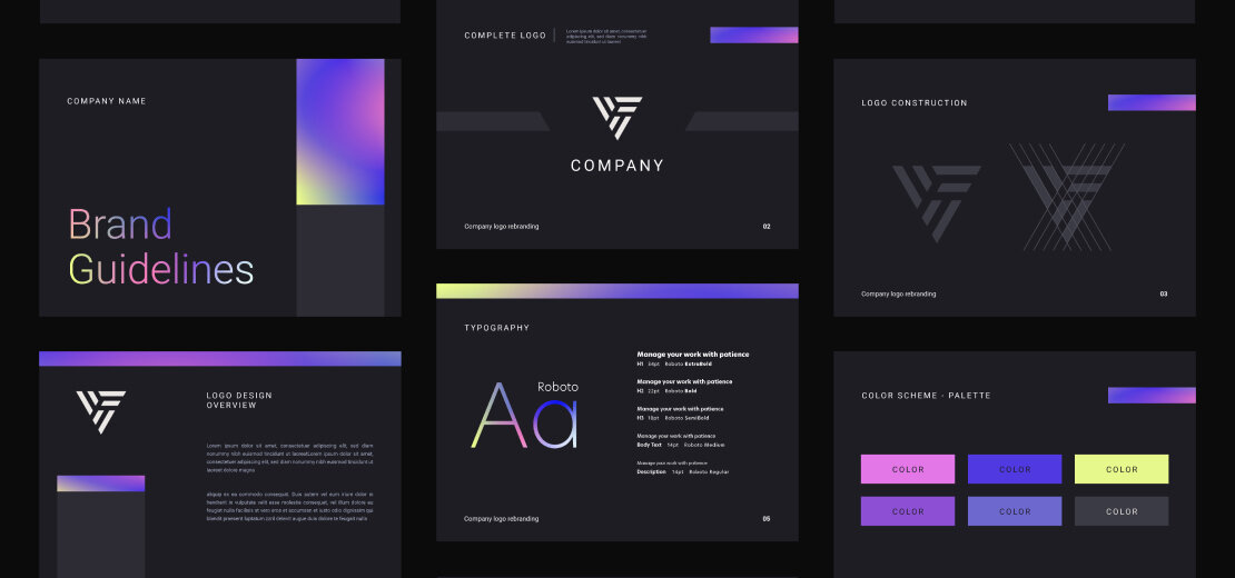
A UI style guide, also known as a design system or pattern library, is a set of instructions that defines a UI's visual and interactive elements. It serves as a reference for designers and developers, helping them ensure consistency in the design and easiness of interface use. The guide may also provide guidelines for content style and copywriting.
A UI design style guide aims to establish cohesiveness across all parts of an application or site. By following the guide, professionals can ensure that every interface component aligns with the overall design language and brand identity.
Ultimately, the guide streamlines the design process, improves efficiency, and results in a polished and professional UX for the user.
How to make a UI style guide?
Creating a UI style guide can seem like a daunting task. But with a little planning and organization, it can be straightforward work. Here are some tips on how to make a UI style guide:
- Start with an audit. Before you can create a UI design style guide, you need to understand the current state of your interface. Take inventory of all the elements that exist in your application or website. Then identify any inconsistencies or areas that need improvement.
- Define your brand identity. A UI style guide should reflect the brand identity of the product or company. Define the brand's colors, typography, and overall aesthetic. Then ensure that the guide aligns with these elements.
- Create visual examples. Use visual examples to illustrate the appearance of design principles and brand identity. It can include examples of typography, color, and layout. Additionally, it can be interactive elements such as buttons and forms.
- Establish guidelines for each element. For each element of the interface, establish guidelines. They need to outline its usage, appearance, and behavior. This may include rules for spacing, font size, color usage, and animation.
- Consider accessibility. Ensure that the style guide includes guidelines for accessible design. Among them are color contrast, font size, and alt text for images.
- Keep it updated. A UI style guide is a living document that should be updated as the interface evolves. Set a schedule for reviewing and updating the guide. Ensure that all designers and developers are aware of any changes.
So, these tips can help you to create a UI style guide. It will ensure consistent UX across all interfaces. Remember to keep the guide updated as the interface evolves. Involve all stakeholders in the creation process. It will help you to ensure that the guide reflects the needs and goals of the product or company.
What should a UI style guide contain?
The UI style guide delivers a set of instructions for great design results. It guarantees the elements in an interface suit the brand identity. So, what should a UI style guide contain? Here is a list of key elements that a comprehensive style guide should include:
- Brand identity guidelines define the colors, typography, and overall aesthetic that align with the brand identity.
- Design principles guide decisions throughout the creation of the UI design style guide. It can include usability, accessibility, and consistency.
- Visual examples show the working of design principles and brand identity.
- Guidelines for each element. They include typography, color palettes, layout, iconography, and imagery. They also can contain interactive elements such as buttons, forms, and animations.
- Accessibility guidelines ensure that the interface is accessible to all users. It should be regardless of their abilities.
- A schedule for reviewing and updating the guide to keep it relevant and useful over time.
- Best practices: This section should outline the best practices for designing and developing user interfaces, including design principles, user research methods, and testing techniques.
By including these elements, a UI style guide can help ensure that the interface is polished and professional, ultimately leading to a better UX.
UI Style Guide Template & examples
UI Style Guide templates are essential tools for designers and developers. They help to create visually appealing user interfaces. These templates provide a set of guidelines, principles, and design patterns. These things help designers create interfaces that are easy to use and navigate.
Many companies and organizations develop their UI Style Guide templates. Designers use them to ensure consistency across all of their products and services. However, there are also many popular third-party templates. Designers and developers widely use them. These templates are typically designed to be flexible and adaptable. So they can be customized to meet the specific needs of a particular project or product.
There are many different UI Style guide templates available. Each has its unique set of guidelines and design patterns. Our team has prepared some popular UI style guide templates for better UX. Let's discuss them in more detail.
Material Design
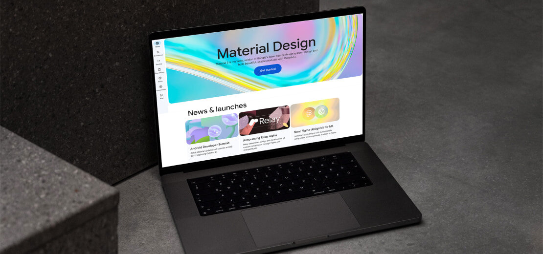
This app style guide provides a comprehensive set of design principles and guidelines. They help to create visually appealing and intuitive interfaces across multiple platforms. The template emphasizes a clean and modern look. They include bold typography, vibrant colors, and subtle animations. Material Design has a concept of a "material" metaphor. In such templates, elements have a tactile quality. They respond to user input naturally and intuitively. Our team has prepared some information about this design style, such as:
- Material Design has been widely adopted by designers and developers worldwide. Actually, many popular apps and websites use it as a design framework. For example, Google's products are all designed using Material Design principles. They include Gmail, Google Drive, and Google Maps. Other examples of Material Design in action include Slack, Flipboard, and Trello.
- Using such templates can help ensure consistency and efficiency in the design process. Additionally, they provide a familiar and intuitive experience for users. It is carried out across different platforms and devices.
Apple Design Template
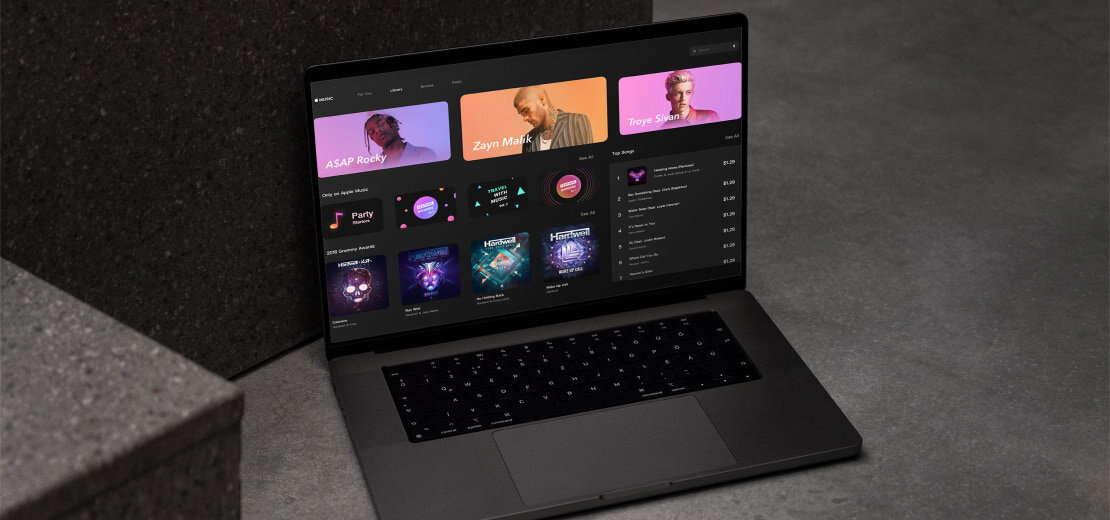
Apple Design is a popular design system Apple uses. It offers an app style guide template with comprehensive design principles, typography, color palettes, and component design specifications for different Apple platforms. Its aim is to provide consistency in design and usability across all Apple products. Let’s talk about this template in more detail.
- The Apple Design Template focuses on minimalist design. It incorporates a simple and clean aesthetic in its design elements. It includes guidelines for the use of typography, color, and layout, as well as icons and imagery. The template also provides guidelines for creating a user interface.It is easy to use and understand.
- This option is regularly updated to reflect the latest design trends. It also ensures that Apple products maintain their design standards. By using this variant, you can create a consistent and visually appealing UI. It will align with Apple's brand identity.
IBM Design Language
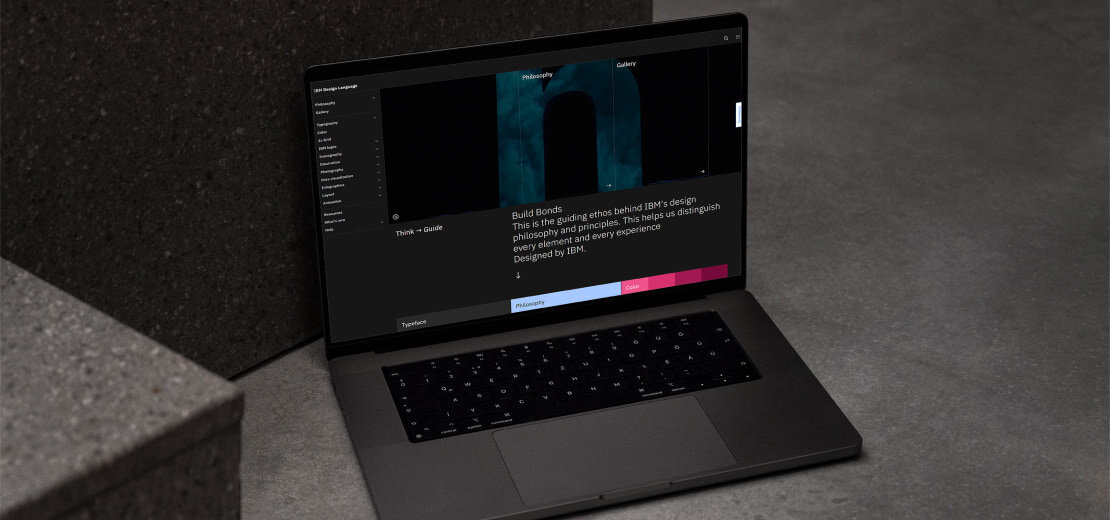
IBM Design Language is a UI style guide template created by IBM. It emphasizes accessibility, simplicity, and consistency. They deliver a set of principles and guidelines. They assist in building interfaces that are easy to use.
The IBM includes typography, color, layout, and interactive elements instructions. Additionally, it can include a comprehensive set of design patterns and examples. IBM's products use this UI design style guide. It includes Watson, IBM Cloud, and IBM Cognos Analytics. Let’s discuss some crucial moments in this design style.
- The design language emphasizes the importance of user-centered design. It contains an emphasis on understanding user needs and designing interfaces. They are easy to use and navigate.
- IBM Design Language also emphasizes accessibility and inclusivity. It includes guidelines for designing interfaces. Such interfaces are easy to use for people with disabilities.
- By using this template, designers can ensure that their interfaces are easy to use. They should also adhere to industry best practices and accessibility standards.
Atlassian Design Guidelines
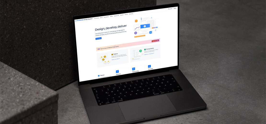
Atlassian Design Guidelines is a UI style guide template created by Atlassian. This company specializes in tools for team collaboration and project management. The design guidelines create interfaces that are functional and visually appealing.
The Atlassian Design Guidelines include guidelines for typography, color, and layout. It also includes interactive elements and a set of design patterns and examples. Atlassian uses this style guide. It can be Jira, Confluence, and Trello. Let’s talk about some facts connected with this style:
- The design guidelines emphasize the importance of usability and simplicity. It has an emphasis on creating interfaces that are easy to use and navigate.
- This template also emphasizes the importance of flexibility, with guidelines for designing interfaces. They can adapt to different devices and screen sizes.
- By using it, designers can ensure that their interfaces are consistent and easy to use. These interfaces also will adhere to industry best practices and accessibility standards. It helps to improve the overall UX. Also, it will make software products more accessible.
Pattern Libraries Template
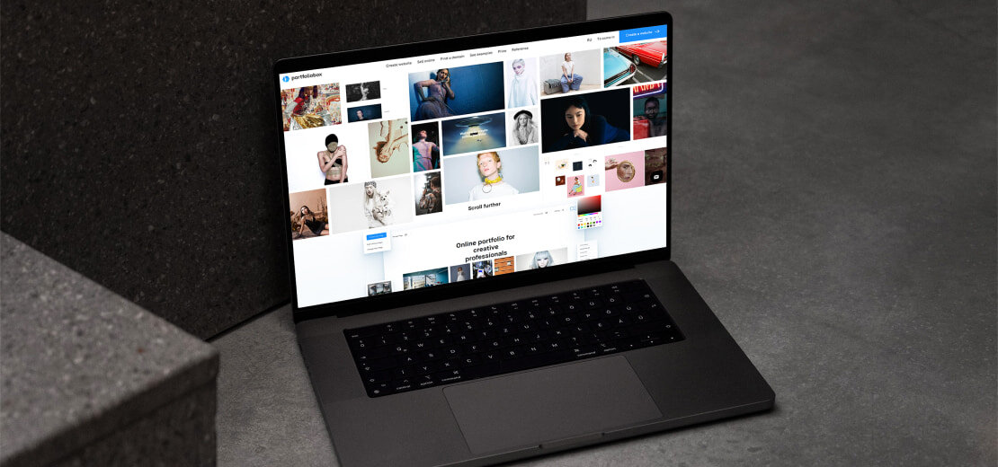
It documents common design patterns and user interface solutions. Such an app style guide template helps to create UI designs that are consistent and familiar to users. They will improve the overall UX. Let’s talk about vital moments of this style:
- Pattern libraries include a collection of UI design patterns. These patterns are commonly used in digital products. Examples of patterns might include login forms, navigation menus, and search bars. Each pattern is documented with design specifications. Among them are typography, color, and layout. It can also include best practices for implementing and modifying the pattern.
- Pattern libraries help streamline the design process. It is because designers can choose pre-existing patterns rather than create new ones from scratch. It not only saves time. But it also ensures consistency across the product's user interface. Additionally, pattern libraries help designers create intuitive and familiar to users UI designs. They should improve the overall UX.
- By using this template, designers can get UI designs that are visually appealing. They also will be easy to use and ultimately improve the success of the product.
So, we’ve helped you with the best UI style guide templates for the best UX works. In conclusion, a well-designed UI style guide template can allow you to create a good UI. For it, they provide a set of guidelines and best practices. These practices will ensure consistency, accessibility, and ease of use. So, it will help to create the best UX words for your portfolio. PortfolioBox helps to make professional-looking online portfolios with ease. So, all professionals can showcase their UI designs in a visually appealing and engaging way. Additionally, PortfolioBox offers various features. With us, artists can enhance their online presence and attract potential clients. Also, they can demonstrate their expertise in UI design.
FAQ
- How do I make my UI UX better?
To improve your UI UX, you can start by analyzing your user needs and preferences. Then, focus on creating a simple and intuitive design. Use clear language and visual hierarchy.
- How do you write a UI style guide?
To write a UI style guide, start by defining your brand identity and visual design principles. Then, outline your UI elements, such as typography, color palette, and button styles. Include examples and guidelines for using these elements consistently throughout your product.
- Why is a style guide important in UX?
A style guide is important in UX because it helps ensure consistency and efficiency in UI design. Providing a reference for designers and developers. With it, a style guide can help create a cohesive UX that is easy to use and understand. It can also save time and resources by avoiding inconsistencies.


