Websites can make or break a brand – personal or professional – so it’s important to keep track of the latest online design trends. Each and every web element will make an impact on your audience. This is true no matter whether you manage a small portfolio, successful retail portal, or multinational company website.
Aesthetics and technology are coming together like never before. That’s why we have put together a short list of web design trends that will get you noticed next year.
From white space to asymmetry, from bespoke illustrations to split design, discover the most popular website trends we expect are here to stay in 2020.
1. Embrace white space
Our eyes are under siege these days. In 2014 alone, people uploaded an average of 1.8 billion digital images every single day. That's 657 billion photos per year – so any attempt to relieve the mass visual suffocation will be welcome. Many designers worry that white space is an inefficient use of visual real estate, but when used correctly, white space creates relief. It also highlights important design elements such as call-to-actions and imparts a sense of balance and tidiness that naturally pleases the eye.
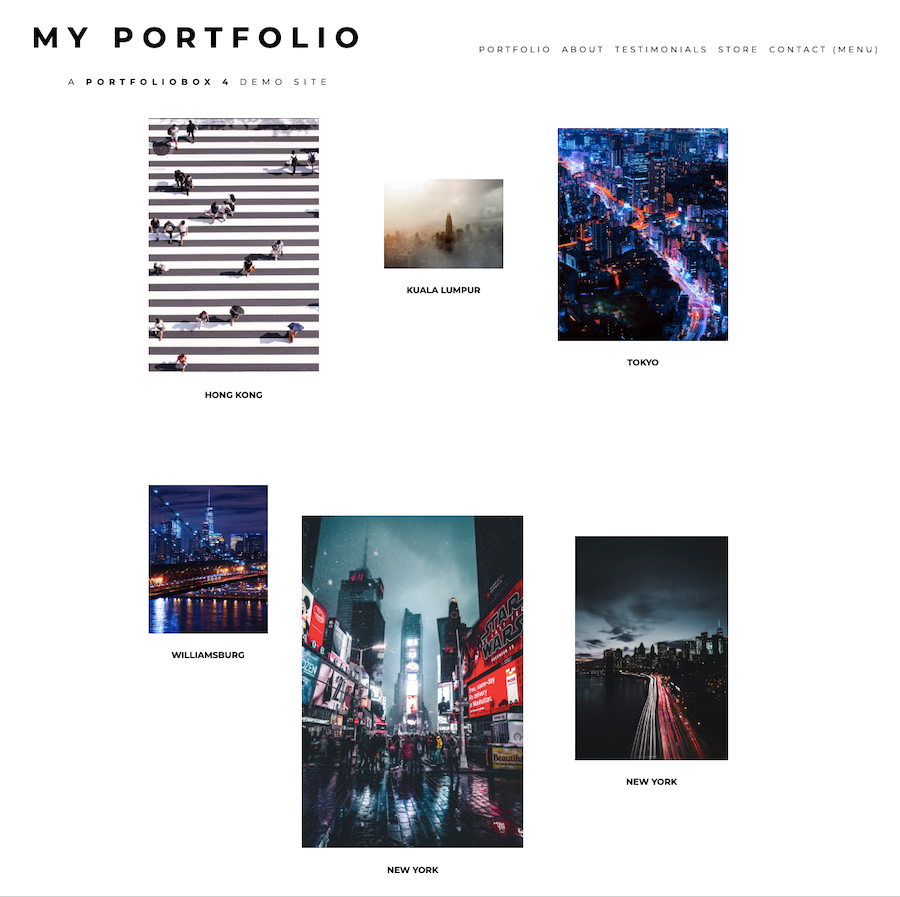
Many website designers are noticing and capitalising on this trend. The new version of Portfoliobox, Portfoliobox 4 offers several templates and settings that allow users to bring white space into their website.

2. Asymmetry is still in
Asymmetrical designs were already trendy in 2019 and will stay with us in 2020. These broken grid layouts break free from rigid, predictable rules of thumb in graphic design, shocking the viewers out of their monotonous scroll. Asymmetry also offers much more freedom for designers to make their website as unique as possible.
It works like this: Imagine a grid of horizontal and vertical lines is used to help layout elements on the page or screen. With most websites, you’ll see the logo, title, and content lined up together as if bound to this imaginary grid. However, asymmetrical designs will purposefully break the grid, pushing images and text alike wildly out of order to make the page feel less rigid.
Mixed with bold colour schemes and strong gradients of geometric fluids, asymmetric shapes are essential to all the hottest web design trends.
3. Oversized elements
Want your website to immediately register – and resonate – with visitors? Enlarged elements such as bold typography, fullscreen images/video and an oversized navigation menu will catch attention, delivering your core message to the audience in a matter of seconds. This supersized approach to design will create a memorable experience that truly impacts on users, even if they only have time for a quick scan... As an added bonus, enlarged elements look fantastic on screens of any and all sizes.
Quick tip: If you go down this route, be sure to reduce the number of design elements on each page. Too many grand features all at once can be overwhelming for visitors.

4. Bespoke illustrations
Appropriate graphics add visual depth to your storytelling efforts and build potent brand identity that leaves a lasting impression on visitors. Bespoke drawings are inherently more interesting than plain old fonts – there’s a reason blogs with images receive 94% more views than those that are text only. By stepping away from stock images and typefaces, your webpage can be custom crafted to show off a unique personality.
If you’re an illustrator building up your own portfolio, or even just a generally artistic individual, using bespoke drawings can be doubly helpful as a self-promotion tool – an organic advertisement of your talents and professional services.
Not so artistic? No problem. Remember, there are lots of resources on the web that give away nuggets of illustrated gold for free, ready for you to jazz up your website.
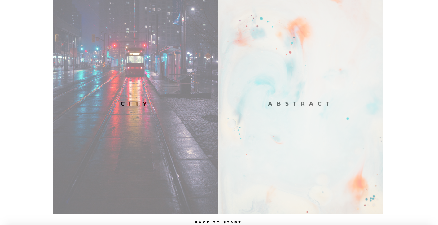
5. Split design
The split design is used to create two separate blocks of information in the same space, giving equal importance to two primary areas of a site – which can be incredibly useful when you have two different services or products to promote.
A split design breaks the usual rectangular screen shape, and by giving prominence to both elements, enables the user to focus on whichever topic most interests them. To make the approach even more dramatic, you can differentiate each section with contrasting, vibrant colours. In some cases, the vertical split is used throughout an entire site or only in some sections.
There are lots of different styles for this trend, so we’re sure it will evolve in 2020. That’s why Portfoliobox 4 will offer several templates that help users create split-screen content tailored to their needs.
6. Mobile-first & fast-loading
Nowadays, more people look at websites on their phones than on a desktop computer. In 2018, mobile usage was at an all-time high with 58% of website visits coming from mobile devices and making up 42% of total time spent online. Mobile-first has become a best practice for web design, no matter what type of site is being created.
If you want to create a seamless mobile experience, here’s a final tip from us: Don’t clutter your website with unnecessary or too heavy content. Always optimise images before uploading them to your website, selecting dimensions and adjusting file sizes as needed for minimum strain on the mobile user experience.
Pulling it all together
There is no one perfect way to pull together a website or online portfolio, so feel free to mix and match all the latest design trends to best portray your own unique style. Just keep in mind that your end goal should always be visual impact and ease-of-use. That’s why working off a template from Portfoliobox, is the surest way to get started – especially if you work within the creative industries, where high-quality visuals are a matter of course.


