Table of Contents
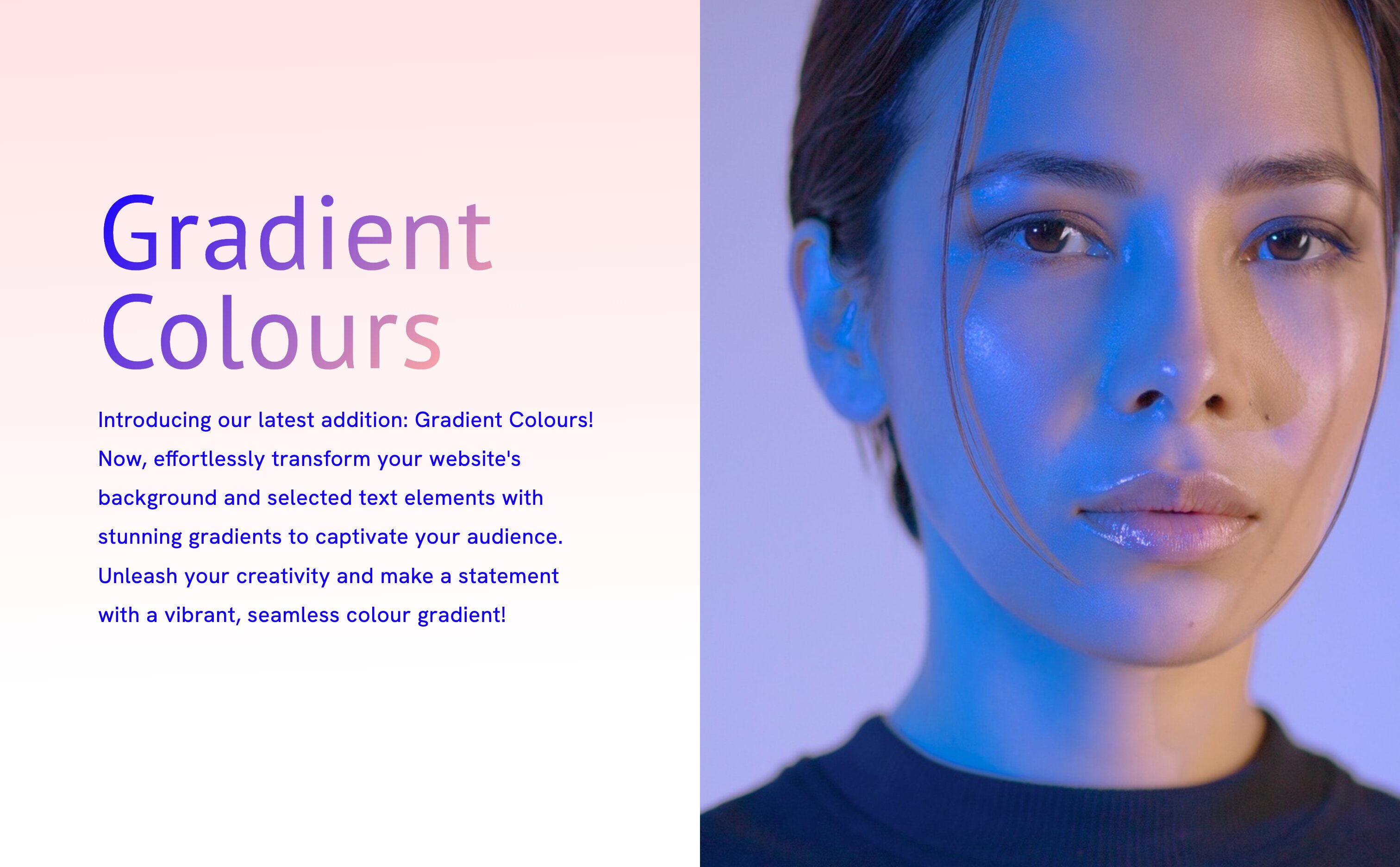
We're excited to introduce our latest design enhancement - gradient colours for website backgrounds and headers. This feature isn't just about aesthetics; it's about making your website stand out.
What are gradient colours?
Gradients are a blend of colours that transition smoothly from one to another. They can be linear, radial or conic, creating a dynamic and vibrant effect. By incorporating gradients, you add depth, dimension, and a modern flair to your site.
Why use gradient colours for your website?
- Visual Appeal: Gradients capture attention and can set the mood or tone of your website.
- Brand Identity: Custom gradients can align with your brand's colour scheme, reinforcing brand recognition.
- User Engagement: A visually appealing site can keep visitors engaged longer, reducing bounce rates.
How to use gradient colours
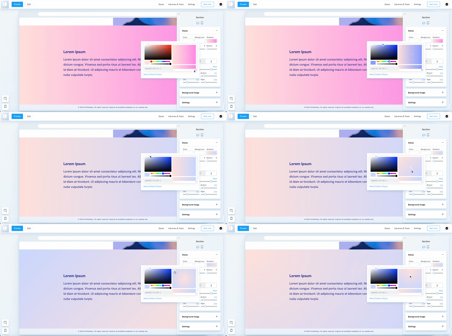
- Click on the gradient colour field.
- Edit the colour stops in the gradient editor.
- Select your preferred gradient type: linear, radial, or conic.
- Then, choose the direction for your gradient type: set the angle for a linear gradient or select the central point for a radial gradient.

Tips for effective gradient integration
Choose complementary colors that blend seamlessly and reflect your brand's identity. Ensure readability by adjusting color contrast, so any text over your gradient remains clear and legible. Experiment with different gradient directions, such as linear, radial, or conic, to find the style that best complements your design.
Start with a subtle color transition if you're new to gradients, keeping it simple to create a smooth effect. Avoid overuse, as too many gradients can be overwhelming—use them strategically to enhance your design. Always test your gradient across devices and browsers to ensure it looks great on every screen.

See an example on our sample page with gradient on headers, background, and text.
