Table of Contents
This article refers to editing the global mobile styles, which will apply to the entire mobile version of your portfolio. You can also edit the mobile style of a specific element on your portfolio, a certain header or paragraph, for example. Editing a specific element will prevail over the global mobile settings.
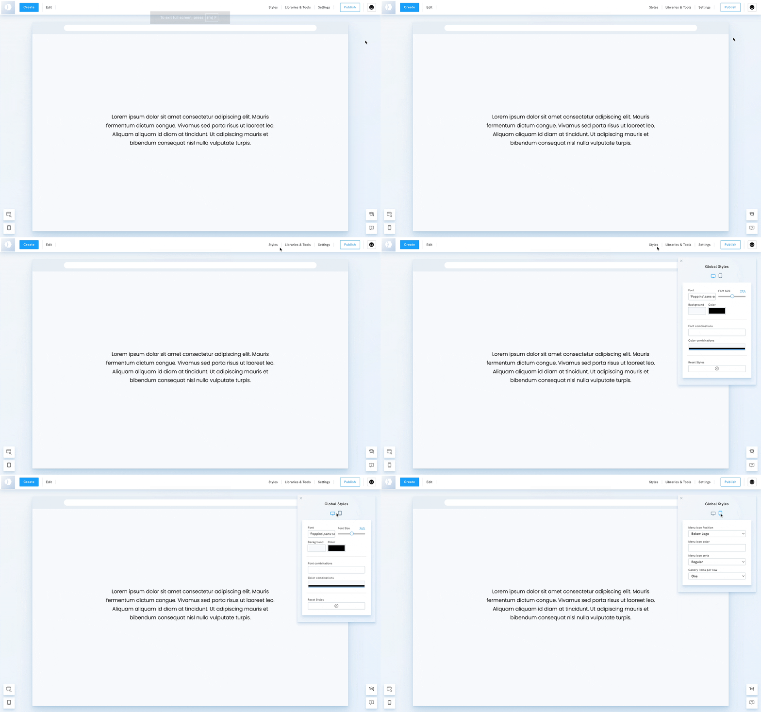
Access the global mobile styles
- Go to Styles
- Click the Mobile Icon
Global mobile styles
The settings below are available in the global mobile styles:
- Menu Icon Position: choose where the mobile menu icon appears (e.g., below the logo).
- Menu Icon Color: adjust the color of the menu icon
- Menu Icon Style: select different styles for the menu icon
- Gallery items per row: control how gallery images and other list-style content are displayed on mobile. Choose between Default, One, or Two images per row for better responsiveness.

